
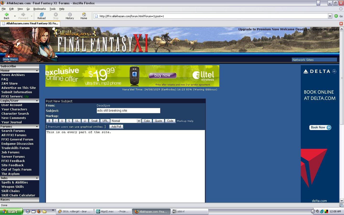
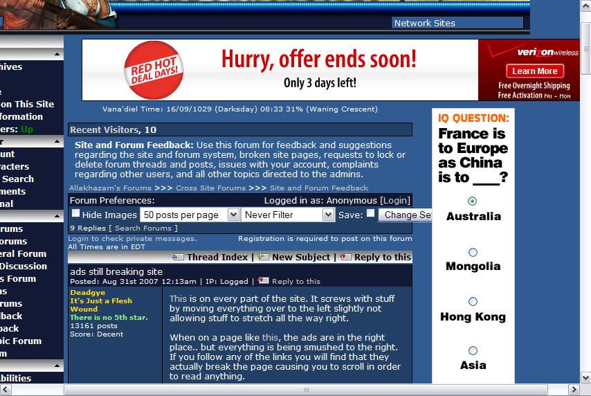
This is on every part of the site. It screws with stuff by moving everything over to the left slightly not allowing stuff to stretch all the way right.
When on a page like this, the ads are in the right place.. but everything is being smushed to the right. If you follow any of the links you will find that they actually break the page causing you to scroll in order to read anything.
Much thanks would be given if this could be fixed.
- Forums
- Cross Site
- Site and Forum Feedback
- ads still breaking site
ads still breaking siteFollow
Dear people I don't like: 凸(â—´―`â—)凸
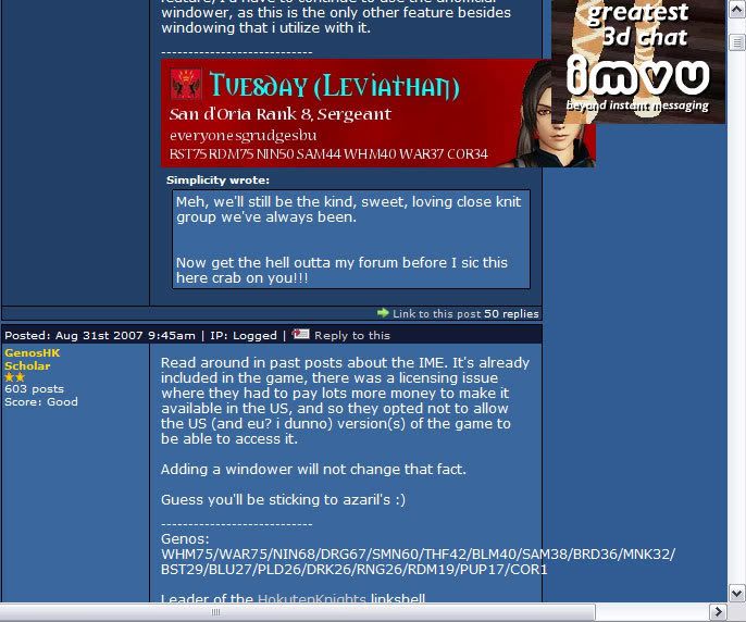
Not really a major problem, but when replying, the Ads seem to be RIGHT on the edge of the reply box, sometimes jumping into a small section of it. Not really that major but still annoying at times.
adblock, nubs thieves!
Codyy wrote:
adblock, nubs thieves!
I have very specific interests.. none of the ads interest me. Showing me ads is stealing from my time... because I would have to view them first to discard them.
Seems to be that the main part of the view forum does not have a proper width attribute and just takes it from the ads instead, so probably only a problem for people using adblock. Guessing premium users have some kind of bar which defines the width in place of the ad.

I'm using adblock. The placeholders for the ads are still there, so the forum is still squished
Shaowstrike (Retired - FFXI)
91PUP/BLM 86SMN/BST 76DRK
Cooking/Fishing 100
"We don't just borrow words; on occasion, English has pursued other languages down alleyways to beat them unconscious and rifle their pockets for new vocabulary."
— James D. Nicoll
91PUP/BLM 86SMN/BST 76DRK
Cooking/Fishing 100
"We don't just borrow words; on occasion, English has pursued other languages down alleyways to beat them unconscious and rifle their pockets for new vocabulary."
— James D. Nicoll
Turned adblock off to test, they put an add banner at the top and another at the right hand side. Its not broken its working exactly how they plan it to be, new add at the right hand side is all.
10 posts
Quote:
When on a page like this, the ads are in the right place.. but everything is being smushed to the right. If you follow any of the links you will find that they actually break the page causing you to scroll in order to read anything.
The problem I am seeing is similar to this one. It looks like the page template is set up to show an ad on the top and an ad on the right. However, not all pages have the ad on the right. On the pages that are missing the ad on the right, it is placing the the page content in this narrow section, which makes it very difficult to read.
It would be nice if this were fixed so the pages are readable again. I don't mind the ads being there. I would rather ignore them as apposed to paying for the site.
Deadgye wrote:
When on a page like this, the ads are in the right place.. but everything is being smushed to the right. If you follow any of the links you will find that they actually break the page causing you to scroll in order to read anything.
This should be fixed now.
rale wrote:
Deadgye wrote:
When on a page like this, the ads are in the right place.. but everything is being smushed to the right. If you follow any of the links you will find that they actually break the page causing you to scroll in order to read anything.
This should be fixed now.
Yep, thanks for that fix. Any word on how long it may take to get the other problem fixed?
Dear people I don't like: 凸(â—´―`â—)凸
I agree with everyone i actually run the aol browser thing (even tho i have broadband) and its totally screwed up please can you move the right side ad to the bottom left again. (same thing happeneing on the WoW forum but i dunno if you can adjust that)
Switching to a higher resolution sort of relives the problem but I need my glasses to see the screen now. T_T
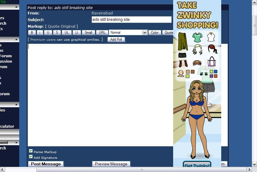
Like the third image Ravensbad linked, having the ads cut into the text box on posting new topics or replies is making things rather difficult. Half the stuff I'm typing for this reply right now I can't even proofread over until I either hit submit or preview. I'm on Internet Explorer at the moment, but these situations come up with other browsers I use as well.
"Go get an ad blocker or go buy Premium" shouldn't be the only answers to these layout issues.
"Go get an ad blocker or go buy Premium" shouldn't be the only answers to these layout issues.
Everything for me is squished to the left, even with adblock. It's more of an annoyance than a problem but any fix would be nice. Here's what it looks like on my screen: http://img169.imageshack.us/img169/6660/untitledwl9.jpg
Edited, Sep 2nd 2007 9:32pm by PaladinStargazer
Edited, Sep 2nd 2007 9:32pm by PaladinStargazer
I don't think they can/too much effort actually do much of a fix for it other than put the ad back to where it was, its very difficult to calculate all widths for every section of the site with such a big alteration. As for everything being squished, thats how its supposed to be, even with adblock they changed the formatting.
The ad should go back to where it was..unless its put there for the sole purpose of annoying non subscribers in which case it makes more sense.
The ad should go back to where it was..unless its put there for the sole purpose of annoying non subscribers in which case it makes more sense.
The Player of the Month and Mediabox are crushed together on the Alla Front page in the FFskin using IE. Looks pretty ugly but at least we can see those adds. >.>
On my computer the ads cover pieces of the text which are extending into the ad.
The framing isn't working properly? Refresh usually, but not always, fixes it till I go to another page then its back to the messed up text.
Naturally it seems worse on the guild recipe pages. Or it bothers me more there, having to unscramble the recipe items.
The framing isn't working properly? Refresh usually, but not always, fixes it till I go to another page then its back to the messed up text.
Naturally it seems worse on the guild recipe pages. Or it bothers me more there, having to unscramble the recipe items.
Are you planning to ever move that ad back to the bottom left instead of the upper right?
Dear people I don't like: 凸(â—´―`â—)凸
Please do, squished forum makes me a sad cat ._.
Deadgye wrote:
Are you planning to ever move that ad back to the bottom left instead of the upper right?
Dear people I don't like: 凸(â—´―`â—)凸
Deadgye wrote:
Deadgye wrote:
Are you planning to ever move that ad back to the bottom left instead of the upper right?
Dear people I don't like: 凸(â—´―`â—)凸
Deadgye wrote:
Deadgye wrote:
Deadgye wrote:
Are you planning to ever move that ad back to the bottom left instead of the upper right?
I hope they keep it in the upper right just to spite you

Only reason I see fit to bump it like that is because the question is completely ignored. There isn't even a "it's staying in the top right to ***** up how the forum is displayed!".
Dear people I don't like: 凸(â—´―`â—)凸
I too would like to add my voice here. Will it be fixed? Is it even being considered?
Sometimes I get a huge blank spot at the top of the page, and the actual threads will be listed under the ad (I'll get a screenie next time it happens). The huge blank spot is almost as annoying as the ads. ; ;
Sometimes I get a huge blank spot at the top of the page, and the actual threads will be listed under the ad (I'll get a screenie next time it happens). The huge blank spot is almost as annoying as the ads. ; ;
Deadgye wrote:
Only reason I see fit to bump it like that is because the question is completely ignored. There isn't even a "it's staying in the top right to ***** up how the forum is displayed!".
The ad is staying on the top right.
--Illia
Fumus, draco magus incoluit mare.
Myrx - 70 Holy Priest, Myr - 70 Resto Shaman, Gryd - 70 Prot Warrior
Fumus, draco magus incoluit mare.
Myrx - 70 Holy Priest, Myr - 70 Resto Shaman, Gryd - 70 Prot Warrior
Recent Visitors: 75
All times are in CST
Anonymous Guests (75)
- Forums
- Cross Site
- Site and Forum Feedback
- ads still breaking site
© 2024 Fanbyte LLC