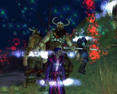
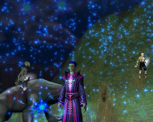
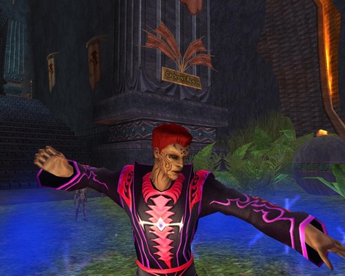
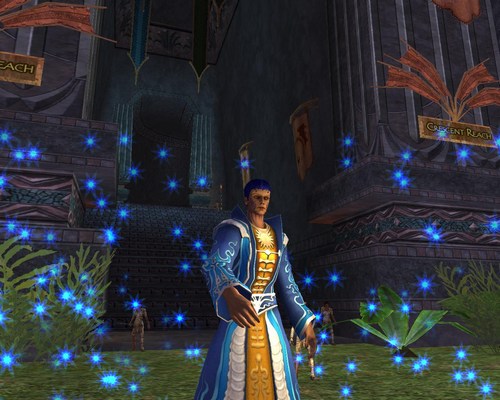
We have four more screenshots to pass along to you. From SOE, they show the Drakkin in action.
Comments
7 posts
Im not sure how they did it but these look worse then the first set of pics.call me crazy but makin them green skin and purple hair dosnt scream make one of these.omg what is SoE thinkin when they do this crap i mean dont they read there emails and msg posts.and maybe just maybe they should try and read what the players think. omg what a concept
Anonymous
How come you guys are always saying bad crap about what soe puts out? My first impression I thought it looked pretty cool.
7 posts
Im not sure how they did it but these look worse then the first group of pics.there even more zombiefied with robes to big for there skinny little bodies.omg SoE really should try and read its emails and msg posts and maybe just maybe listen to the ppl who play the damn game
Scholar
24 posts
A whole race of Max Headroom?
Scholar
47 posts
Looks like my backyard on Friday nites.
They look like High Elfs with tattoos and a dry skin problem.
C'mon, half dragon and half human is what SoE is wanting us to think they are.
C'mon, half dragon and half human is what SoE is wanting us to think they are.
Anonymous
not very interesting. I mean sure, they can spike their hair, but big deal. /agree with the first post, they seem too big for their bodies
24 posts
I really hate the posture, the luclin models may not be realistic but at least they don't look bored like these guys.
Anonymous
The faces look interesting. Although their robes have neat designs, I don't like the way they look on their body. They seem too big for the Drakkin's body, and it doesn't look like fabric to me - more like plastic.
1 post
Female opinion I absolutely hate the hair so far. Dragons are one of the most beautiful and graceful creatures on EQ. I think long and flowing would have fit better. Hope the female version has more attractive options.
Free account required to post
You must log in or create an account to post messages.© 2024 Fanbyte LLC


